Widget Types
Indicator
- Definition: Provides a numeric value for specific campaign metrics
- Examples of data: Phish/Report Rates, Training Completion and on-time Completion Percentages

Pie Chart
- Definition: Used to compare the distribution of learner data or campaign statistics. The data is then displayed in relative proportional slices that make up a circle.
- Examples of data: Completion or Phish Rate % by Department, Learner language usage

Column Chart
- Definition: Presents learner data and/or campaign statistics in vertical columns (with values on the y axis and categories on the x axis).
- Examples of data: Comparing department completion percentages, or report/phish rates

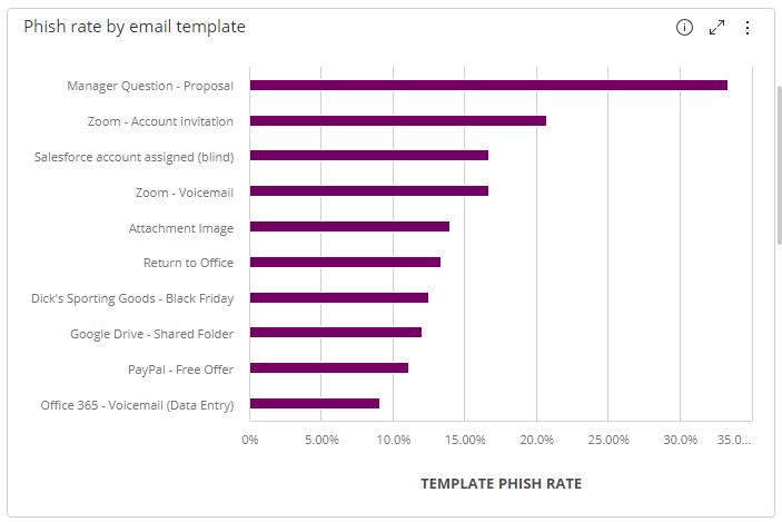
Bar Chart
- Definition: Presents learner data and/or campaign statistics using horizontal bars (with values on the x axis and categories on the y axis)
- Examples of data: Comparing department completion percentages, or report/phish rates.
Line chart
- Definition: Used to compare changes in learner data and campaign metrics over the same period of time
- Examples of data: Phish Rate overtime

Area Chart
- Definition: An extension of a line chart, where the area under the line is filled in.
- Example of data: Completion Rate overtime

Pivot Table
- Definition: A table of grouped learner data and/or campaign metrics that aggregates the individual items of a more extensive table within one or more categories
- Examples of data: Showing each department and the count of the different phish statuses.

Table
- Definition: It displays Learner data and/or campaign metrics with no transformations done to it (i.e. no formulas or groupings)
- Examples of data: List of all learners and their attributes

Table with Aggregation
- Definition: Much like a table, but it allows admins to add a formula to combine/total data.
- Examples of data: Learners and the behaviors that impact their overall Risk Score

Scatter Chart
- Definition: Uses dots to represent values for two different numeric variables
- Examples of data: Phish rate and completion time. Assessment category and Average score for each

Tree Map
- Definition: An interactive widget that displays hierarchical data as a set of nested rectangles. Each Rectangle is proportional to the specified dimension of the data selected.
- Examples of data: Departments and the number of learners in each would be the size of the rectangle, and the colors would represent the department’s phish rate.

Calendar Heat Map
- Definition: Uses colored cells, typically in a monochromatic scale, to show relative number of campaign and/or learner events for each day in a calendar view
- Examples of data: Allows admins to see what days of the week, or months, have the highest phish rates

Scatter Map
- Definition: Highlights areas on the map where certain campaign events or learner actions have taken place.
- Examples of data: Phish/Completion rate by country

Area Map
- Definition: Geographical representation of data (location shading)
- Examples of data: Phish/Completion rate by country

Sunburst
- Definition: Used for hierarchical data, multi-dimensional pie chart
- Examples of data: Phish Rate by department and campaign

Box and Whisker Plot
- Definition: Used for comparing points to the median
- Examples of data: Assessment Scores, learner risk score by department/country

Polar Chart
- Definition: Used for displaying multivariate observations with an arbitrary number of variables in the form of a two-dimensional chart
- Examples of data: Department analysis - phish rate by email template

Funnel Chart
- Definition: Displays specific learner data or campaign metrics in stages.
- Examples of data: Phish Status and the number of events
